Data Visualization Resources
Papers
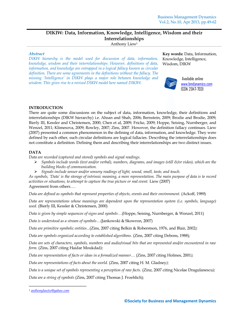
(PDF) DIKIW: Data, Information, Knowledge, Intelligence, Wisdom and their Interrelationships
DIKW hierarchy is the model used for discussion of data, information, knowledge, wisdom and their interrelationships. However, definitions of data, information, and knowledge are entrapped in a logical fallacy known as circular definition. There are some agreements in the definitions without the fallacy. The missing 'Intelligence' in DIKW plays a major role between knowledge and wisdom.
 https://www.researchgate.net/publication/236870996_DIKIW_Data_Information_Knowledge_Intelligence_Wisdom_and_their_Interrelationships
Articles
Data and Empathy
DataViz-The UnEmpathetic Art
Can dataviz evoke empathy? Should it even? And if so how? First post in a series towards The Responsible Data Forum on the topic of Data Visualization, Jan 2016, NYC. "If I look at the mass I will never act. If I look at the one, I will."
 https://responsibledata.io/2015/10/19/dataviz-the-unempathetic-art/
What If the Data Visualization Is Actually People?
"Are we there yet?" It's a classic question. You're a kid. And you're in the back seat of the car. And it's an endless drive. And you just want to know "When, when, when will the wait be over?" And your parents say "45 minutes" and now you have something to count.
 https://source.opennews.org/articles/what-if-data-visualization-actually-people/
Connecting with the Dots
One of my favorite movies is the classic 1949 thriller "The Third Man." The story is about a writer who arrives in gloomy post-war Vienna on the promise of a job only to instead unravel a criminal conspiracy to peddle diluted-and thus ineffective-antibiotics.
 https://source.opennews.org/articles/connecting-dots/
Big data problems we face today can be traced to the social ordering practices of the 19th century.
In the 19th century, changes in knowledge were facilitated not only by large quantities of new information pouring in from around the world but by shifts in the production, processing and analysis of that information.
 https://blogs.lse.ac.uk/impactofsocialsciences/2015/10/13/ideological-inheritances-in-the-data-revolution/
Gyaan
The unspoken rules of visualisation: (and when to break them)
(and when to break them) 29 January 2020 Visualising data is like solving a jigsaw puzzle. To be successful, there are some things you should know in advance -- the scene to be revealed by the pieces is the story you'd like the data graphic to convey.
 https://datajournalism.com/read/longreads/the-unspoken-rules-of-visualisation
Factfulness
Factfulness
"The stress-reducing habit of only carrying opinions for which you have strong supporting facts." - See the book Factfulness " Factfulness is a relaxing habit for critical thinking. It helps you maintain a fact-based worldview. It teaches you how to recognise and avoid the most common ways information gets misinterpreted.

DataViz History
An interactive infographic on the History of Infographics, and the process behind it.
The History of Data Visualization
The term "Data Visualization" may have firm roots in the 20 th Century, but the concept of data storytelling is as old as time. Humans have been expressing the world through data dating as far back to the invention of the seismograph, the collapse of the Han Dynasty, and the rise of Buddhism.

Case Studies
The World According to China
China made large investments in two other South American countries, Venezuela and Argentina, that defaulted on debts to the West, guaranteeing China a steady supply of oil and construction contracts for Chinese companies. CHINA'S SHARE OF INVESTMENT IN LATIN AMERICA 2005-2013 State-run Chinese banks have lent more than $50 billion to Venezuela, propping up an unstable regime in exchange for oil.

New Horizons' Pluto Flyby
The Pluto system is tipped on its side, like a target facing the sun. New Horizons did not carry enough fuel to go into orbit around Pluto, so it had only one chance to study the dwarf planet up close. The Pluto system is tipped on its side, like a target facing the sun.

United States gun death data visualization by Periscopic
U.S. gun deaths 2010 & 2013: you haven't seen numbers like this before: https://guns.periscopic.com/ by @periscopic
Toaster vs. Freezer
Would a toaster still work in a freezer? - My Brother, My Brother and Me, Episode 343, discussing a Yahoo Answers question On a recent episode of Justin, Travis, and Griffin McElroy's terrific advice podcast, My Brother, My Brother and Me, the brothers pondered a Yahoo Answers question about what would happen if you put a toaster inside a freezer.

XKCD is coming to America's science textbooks
Textbook giant Houghton Mifflin Harcourt publishes Randall Munroe's amazing Thing Explainer, and a lucky accident happened when someone in the textbook division noticed Munroe's amazing explanatory graphics, annotated with simple language (the book restricts itself to the thousand most common English words) and decided to include some of them in the next editions of its high-school chemistry, biology and physics textbooks.

Case Study Sources
This is a non-exhaustive list. There are more sources out there, and you are free to choose from them. This list will be updated as new and interesting sources are stumbled upon.
FlowingData
FlowingData
 https://flowingdata.com/
Work
Add a description about your page or projects. Should be around 135 to 160 characters.
 https://infowetrust.com/work
Periscopic: Do good with data
Information is Beautiful
Distilling the world's data, information & knowledge into beautiful infographics & visualizations
 https://informationisbeautiful.net/
r/dataisbeautiful
r/dataisbeautiful: A place to share and discuss visual representations of data: Graphs, charts, maps, etc.
 https://www.reddit.com/r/dataisbeautiful/
r/DataArt
The place for aesthetically satisfying data visualizations that you'd be proud to hang on your wall. ||| Sign up to the mailing list: artycharty.firebaseapp.com ||| Follow us on Twitter: twitter.com/ArtyCharty
 https://www.reddit.com/r/DataArt/
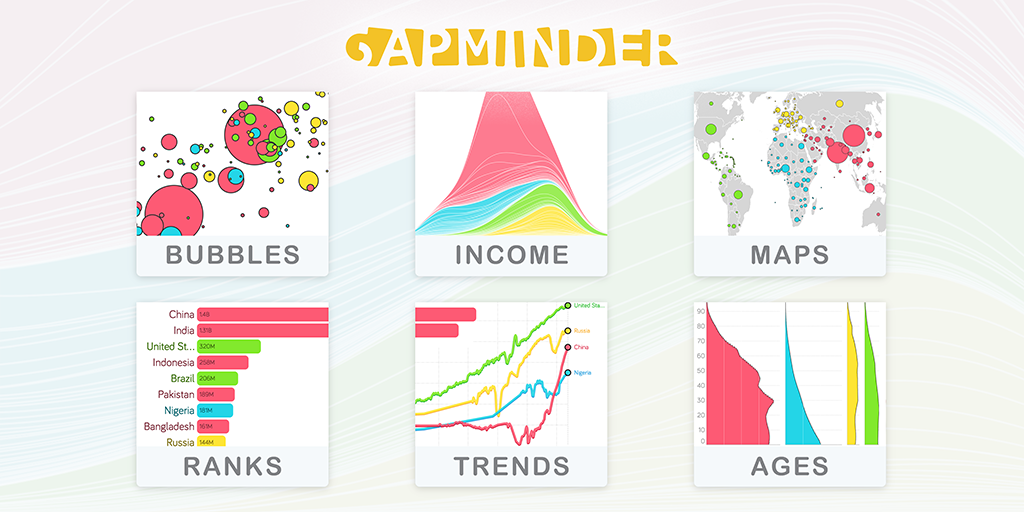
Gapminder
Imagine the world as a street. All houses are lined up by income, the poor living to the left and the rich to the right. Everybody else somewhere in between. Where would you live? Would your life look different than your neighbours' from other parts of the world, who share the same income level?

Our World in Data
Research and data to make progress against the world's largest problems

Explorable Explanations
Lion cubs play-fight to learn social skills. Rats play to learn emotional skills. Monkeys play to learn cognitive skills. And yet, in the last century, we humans have convinced ourselves that play is useless, and learning is supposed to be boring. Gosh, no wonder we're all so miserable.
 https://explorabl.es/

Maps & Data
The Aqueduct Global Flood Analyzer is a web-based interactive platform which measures river flood impacts by urban damage, affected GDP, and affected population at the country, state, and river basin scale across the globe.

Chit Chart | Let's talk about facts
Our team collects data from reliable sources on the Internet and designs charts in order to communicate simple, or not so simple data about our world. We consider our website to be more fun and less educative. We are doing our best to assure that our charts are 100% correct, but we also need your help.
The Pudding explains ideas debated in culture with visual essays.
The Pudding explains ideas debated in culture with visual essays.
 https://pudding.cool/
Gramener Blog
August 04, 2017 - We happened to find an entire dump of close to 1500 Hindi movie songs (released) of Kishore Kumar & feasted on it. An accurate database of Bollywood songs is so hard to find and we were simply happy to depend entirely on the information provided by the meta tags from the mp3 dump.
https://gramener.com/blog/

Other interesting Case Studies
Gun Deaths In America
The data in this interactive graphic comes primarily from the Centers for Disease Control and Prevention's Multiple Cause of Death database, which is derived from death certificates from all 50 states and the District of Columbia and is widely considered the most comprehensive estimate of firearm deaths.
 https://fivethirtyeight.com/features/gun-deaths/
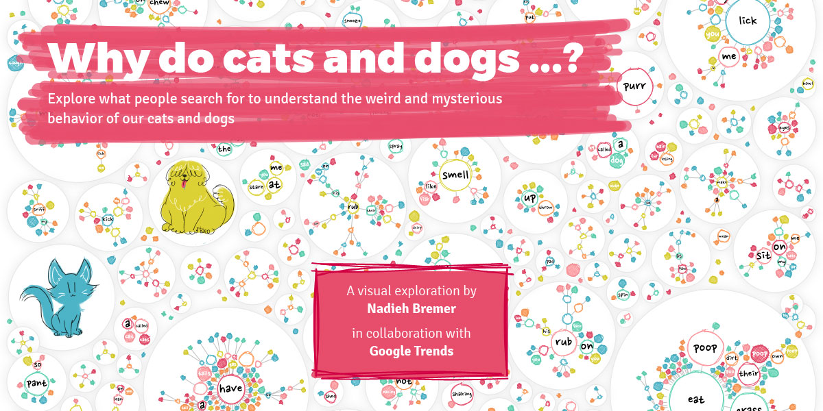
Why do cats and dogs ...?
You know, cats and dogs can be utterly strange sometimes. Actually, more often than sometimes. Ever since getting a cat 14 years ago, I've come to realize how truly enigmatic animals can be. Why does my cat go crazy for my sweaty gym clothes?
 https://whydocatsanddogs.com/
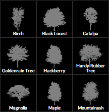
An Interactive Visualization of NYC Street Trees | A Project by Cloudred
We were curious about the common and no- so-common trees planted in the five boroughs of New York City. We wanted to create a visualization that allow us to quickly evaluate tree distribution. We believe that engaging, visual interfaces have the power to make complex datasets more accessible."
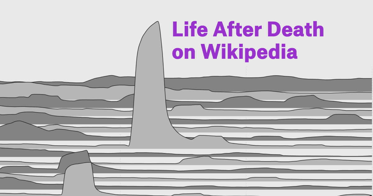
Life After Death on Wikipedia
But just how big? To put it in perspective, let's look at living icon Beyoncé. Here are her (English-language) Wikipedia pageviews between March and May of 2016, in 48-hour intervals. On April 24, Beyoncé dropped and the internet went wild. Her pageviews increased tenfold from about 30 thousand to nearly 300 thousand.
30 Years of American Anxieties
Husbands who have lost interest in sleeping with their wives were especially common in the 2010s. Whether it's because they're "addicted to adult porn movies" or have simply lost interest, sexually frigid husbands were the most common sex-related concern.

Hooked: how pokies are designed to be addictive
Poker machines use a range of design features that leverage psychology to keep people playing. Here, we break them down so you can see exactly how they work, and how it affects people
 https://www.theguardian.com/australia-news/datablog/ng-interactive/2017/sep/28/hooked-how-pokies-are-designed-to-be-addictive
Parable of the Polygons
These little cuties are 50% Triangles, 50% Squares, and 100% slightly shapist. But only slightly! In fact, every polygon prefers being in a diverse crowd: You can only move them if they're unhappy with their immediate neighborhood. Once they're OK where they are, you can't move them until they're unhappy with their neighbors again.
 https://ncase.me/polygons/
THE DARK SIDE OF THE FOOD - Dark Version
Data on restaurant-associated food borne outbreaks reported in England and Wales from 1992 to 2009. This data visualization was originally made for the "Food Poisoning" challenge organized by Kantar ...

Interactive graphic: See every satellite orbiting earth
It's the world above us.
 https://qz.com/296941/interactive-graphic-every-active-satellite-orbiting-earth/
DataSets
A lot of the case studies have their datasets available as well. Look out for those too.
Datasets - Data | World Resources Institute
The Tracker contains information on two types of renewables activities commonly being pursued by local governments in the United States: 1. Electricity purchases and transactions, such as on-site solar, community solar projects, off-site power purchase agreements (PPAs), and green tariff...
 https://datasets.wri.org/dataset
 https://numerical.co.in/
Tools
*Digital tools. Analog is infinite.
**Non-exhaustive list. You are free to explore other tools as well.
- MS Excel
- Adobe Illustrator (duh!)
- Processing | p5.js
- Tableau Desktop
Resources
Iron Viz is Tableau's own data visualization contest which consists of a series of topic-themed virtual qualifier competitions that determine the finalists who advance to a live on-stage championship at either Tableau Conference Europe or Tableau Conference.
- Datawrapper
Datawrapper
It's free & no sign-up needed. Use one of our 19 interactive & responsive chart types ranging from simple bars and lines to arrow, range and scatter plots. Learn more about our charts We offer three interactive & responsive map types for making anything from locator maps to thematic choropleth & symbol maps.
 https://www.datawrapper.de/
- Google Data Studio
- Gapminder.org
Gapminder Tools
Animated global statistics that everyone can understand
Word Counters
Word Count Tool - The Best Word Counter
What is regarded as a word? A word contains many characters (even including emoji). Words are separated by spaces, hyphens, punctuation marks... What is regarded as a difficult word? A word that does not belong to the list of 3000 familiar words. What is regarded as a unique word?

WordCounter - Count Words & Correct Writing
Apart from counting words and characters, our online editor can help you to improve word choice and writing style, and, optionally, help you to detect grammar mistakes and plagiarism. To check word count, simply place your cursor into the text box above and start typing.

Maps
CADMAPPER - Worldwide map files for any design program
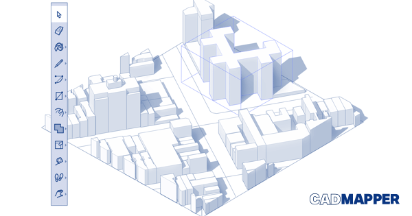
Free City Files Help Sign In Instant CAD files for any location on earth. Architects and urban planners use Cadmapper to save hours of routine drawing. It transforms data from public sources such as OpenStreetMap, NASA, and USGS into neatly organized CAD files.
 https://cadmapper.com/
Other Interesting Content
Visual Vocabulary
http://ft-interactive.github.io/visual-vocabulary/
Data Is Beautiful
This channel is my passion project taking us on a fun trip down memory lane together so we can relive the colorful events we all experienced. I am a first-ye...
 https://www.youtube.com/channel/UCkWbqlDAyJh2n8DN5X6NZyg/featured
[OC] Florence on the move - Looking at the Nightingale chart from different perspectives
60.5k members in the visualization community. For topics related to information visualization and the design of graphs, charts, maps, etc.
 https://www.reddit.com/r/visualization/comments/hop0gj/oc_florence_on_the_move_looking_at_the/?utm_source=share&utm_medium=web2x
149 | xkcd or the art of data storytelling with web cartoons
Randall Munroe is the mastermind behind the xkcd webcomics which have zillions of fans around the globe. In his stick figure cartoons and hilarious mini-stories, he comments on complicated scientific issues. Over the years, Randall has also created a number of data-heavy visualizations.
 https://datastori.es/149-xkcd-or-the-art-of-data-storytelling-with-web-cartoons/#t=49:49.499

Podcasts
Data Stories
Show full episode archive 11/01/2017 Dear Data Stories Friends, We are ready to try something new together with you. After many years of financial support from our generous sponsors, we now want to move to a crowdfunding model, where the show is funded by you - our listeners.
 https://datastori.es/

Freakonomics - The hidden side of everything
After Bode Miller told 60 Minutes that he often drank the night before ski races, and that he'd even raced while still drunk, he was raked over the coals and forced to grovel and apologize. Now we learn that Tour de France winner Floyd Landis (here's a recent posting on the subject), who tested...

 https://history.infowetrust.com/
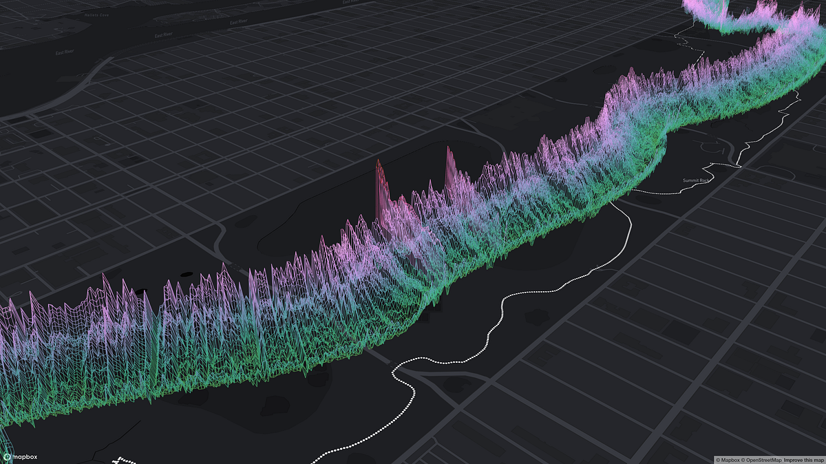
 https://medium.com/senseable-city-lab/sonic-cities-listening-to-parks-during-lockdown-f9027b7deb46